
UX Mistakes Apps Make — And How to Avoid Them
Every app starts with a good idea, but a great user experience is what truly makes it successful. When an app is easy to navigate, loads quickly, and provides a user-friendly experience, people keep coming back. In this article, we’ll look at common UX mistakes that many apps make, along with practical tips on how to avoid them.
Why UX Matters For App Success
User Experience (UX) isn’t just about how your app looks. It’s about how it works and how people feel when they use it. A thoughtful UX makes the app simple to understand, easy to use, and enjoyable to return to. When the experience is smooth, users are more likely to stay engaged and keep coming back.
Good UX helps users:
- Understand what your app is meant to do
- Move through tasks without confusion or frustration
- Feel confident in using the app regularly
- Build trust in your brand and the product
- Recommend the app to others
On the other hand, poor UX can cause problems that are hard to ignore. Even if the app idea is strong, a frustrating experience can quickly push users away.
Bad UX often leads to:
- High bounce rates, where users leave after a short time
- Negative reviews that hurt your app’s reputation
- Low retention, with users not coming back after their first visit
- Missed opportunities for purchases, signups, or conversions
- Lost revenue and reduced growth potential
To solidify the above points, let’s look at this interesting stat: according to a report by Amazon Web Services, e-commerce businesses lose 35% of sales because of bad UX.
Justin Mifsud, Founder at Usability Geek says 88% of online consumers are less likely to return to a site after a bad experience. [Source: Amazon Web Services]
Hence, UX directly affects how people interact with your app and whether they choose to keep using it. Paying attention to the user journey, removing friction, and designing with clarity can make all the difference in building a successful app.
Common UX Mistakes in Mobile and Web Apps
A smooth user experience can turn a simple app into a favorite one. But when the experience is frustrating or unclear, even great ideas can be overlooked. Let’s explore some common UX mistakes and why they matter.
Cluttered Screens

Too much information on a single screen can overwhelm users. When there are too many buttons, text blocks, or images, it becomes difficult to focus. Clean layouts, clear hierarchy, and space between elements help users feel more comfortable and in control.
Poor Navigation Flow

If users struggle to find what they need or don’t know what step to take next, they will likely give up. Menus, buttons, and back paths should be simple, clear, and consistent across the app. Good navigation makes users feel confident and supported.
Lack of Onboarding

Introducing new users to your app without guidance is like handing someone a device with no instructions. A short onboarding experience can make a big difference. Highlighting key features, showing how to get started, or offering tips in context helps users feel welcome and prepared.
Tiny Touch Targets

When buttons or clickable elements are too small, users may tap the wrong thing or miss the target completely. This is especially frustrating on mobile devices. Larger, well-spaced touch areas improve usability and reduce errors.
Slow Performance

People expect apps to respond quickly. If screens take too long to load or animations drag, users may lose patience. Optimizing speed and keeping the experience smooth makes the app feel more professional and user-friendly.
Inconsistent Design

If your app uses different fonts, button styles, or color schemes across screens, it can look unpolished. A consistent design helps users understand the app faster and trust the experience.
Ignoring Accessibility

Not every user interacts with your app the same way. Some may rely on screen readers, voice commands, or high-contrast views. If your app doesn’t support these needs, you’re excluding a large group of potential users. Designing with accessibility in mind creates a more inclusive and respectful experience for everyone.
How to Avoid These UX Issues
The good news is that most user experience problems are avoidable with a thoughtful approach and regular testing. Here are practical ways to prevent common UX issues and create a smooth and user-friendly experience for your users:
Use Clear Visual Hierarchy
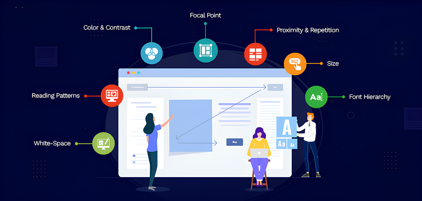
Help users know where to look and what to do next. Highlight the most important actions using visual cues like size, color, and spacing. Headings, buttons, and call-to-action should guide the eye naturally, without overwhelming the user.
Stick to Familiar Patterns
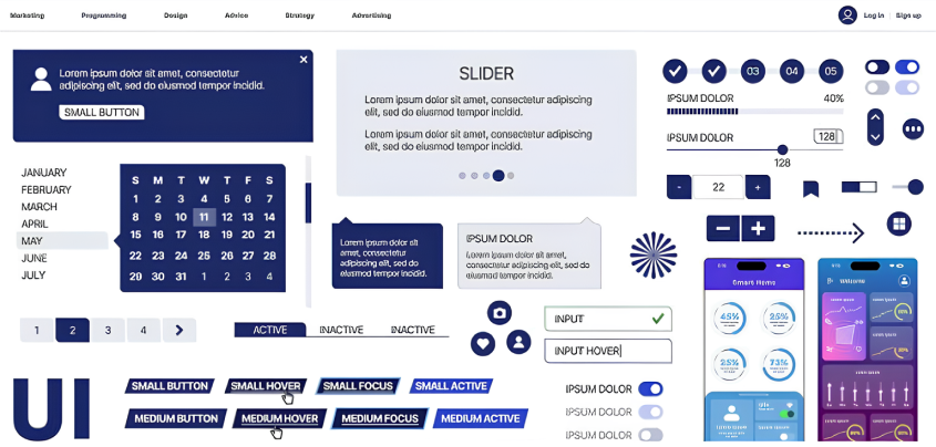
People already know how certain apps work. Mobile users, for example, expect bottom navigation bars or back buttons in predictable places. Following these conventions reduces confusion. Only introduce new patterns if they genuinely improve the experience.
Prioritize Speed and Performance

A slow app can quickly frustrate users. Compress images, remove unnecessary code, and use lazy loading for content that isn’t immediately visible. Using lightweight animations and reducing wait times makes your app feel faster and more responsive.
Create Helpful Onboarding

Instead of dropping users into a blank screen, offer guidance through tooltips, welcome messages, or short walkthroughs. A well-designed onboarding process helps users understand the value of your app and how to use it effectively from the start.
Test With Real Users

Your team may know the app inside out, but real users will interact with it in unexpected ways. Even testing with a handful of users can reveal problems you hadn’t noticed. Simple usability tests can highlight confusing flows, unclear wording, or visual distractions.
Make Accessibility Part of Design
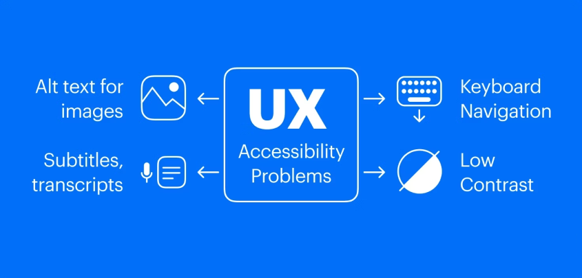
Accessibility should be built into the design process, not added later. Use readable fonts, maintain strong color contrast, and ensure that all interactive elements can be accessed with a keyboard or screen reader. Tools like WAVE or axe DevTools can help you identify and fix issues early on.
Real-World Examples
Let’s take a closer look at how UX choices affect user behavior in real scenarios:
Example 1: Confusing Checkout Process
An eCommerce app has six buttons on the checkout screen: “Save,” “Apply Coupon,” “Continue,” “Back,” “Edit,” and “Pay Now.” The options are crowded together, and it’s unclear which one is the next step. As a result, users abandon their carts out of confusion.
Improved UX: The app redesigns the screen with one clear “Proceed to Payment” button. Optional actions like applying a coupon or editing the cart are placed lower and styled more subtly. This small change leads to a noticeable increase in completed purchases.
Example 2: Poor Form Design
A travel booking app asks users to fill out a long, multi-step form with no progress indicator. There’s no way to save progress, and if users accidentally hit “back,” they lose everything. Many leave halfway through the process.
Improved UX: The app breaks the form into short, manageable steps and adds a visible progress bar. It also saves inputs automatically and allows users to return to unfinished steps. Completion rates improve, and users feel less overwhelmed.
Example 3: Hard-to-Find Navigation
A budgeting app hides its main navigation under an unlabeled icon in the top corner. New users can’t find their way around and often exit without completing setup.
Improved UX: The app introduces a bottom navigation bar with clearly labeled icons for Home, Transactions, Insights, and Settings. Onboarding now includes a quick tour of each section. User retention in the first 7 days goes up.
Example 4: Small Buttons on Mobile
A food delivery app has tightly packed menu items and tiny icons. Users keep tapping the wrong items, especially when ordering on smaller devices.
Improved UX: The layout is redesigned with larger buttons, more spacing, and bigger tap targets. Users can now navigate and order with ease, as a result, fewer drop-offs during checkout.
Example 5: No Feedback After Actions
A task management app lets users tap “Save” after editing a task, but nothing happens on screen. There’s no message, animation, or confirmation. Users are left unsure if their update was successful and sometimes repeat the action or leave the app altogether.
Improved UX: The app adds a quick success message and a subtle animation to confirm that the task was saved. This small bit of feedback reassures users that their action was completed. As a result, users feel more confident using the app.
Conclusion
Great UX doesn’t have to be complex or fancy. What matters most is that your app is clear, useful, and reliable. Users should be able to understand how it works, feel confident while using it, and accomplish their goals without frustration. When that happens, they’re far more likely to return, recommend it to others, and build a lasting connection with your product.
The truth is, many apps struggle not because of a lack of features, but because they overlook how real people interact with them. Simple design oversights like confusing navigation, slow performance, or lack of feedback can have a big impact on user trust and retention.
At Brevity Software Solutions, we specialize in creating apps that provide a user-friendly experience. We believe that great design is about making things easy, intuitive, and accessible for everyone. Whether you’re starting from scratch or improving an existing product, our team can help you identify UX challenges and turn them into growth opportunities.
Related Post


-
F
-
A
-
Q
UX is about how users feel when using the app. UI (user interface) is what the app looks like. Good UI supports good UX.
You can run usability tests, collect feedback, or use tools like Hotjar or Google Analytics to see where users drop off.
UX is not a one-time task. You should refine it regularly based on feedback and analytics.
Yes, we can audit your current app, identify friction points, and redesign flows that feel natural to your users.
Some common signs include high bounce rates, low user retention, frequent support requests, negative reviews, or users dropping off before completing key actions like signing up or making a purchase.
It depends on the scope of the issues and the complexity of the app. Some improvements can be made quickly, while others may need deeper redesign work. We can provide a clear timeline after understanding your specific goals and reviewing the current state of the app after a consultation.
Not always. Often, small changes like simplifying a form, improving button size, or reworking the onboarding flow can make a big difference without rebuilding the whole app.
Tools like Figma, Adobe XD, and Sketch are great for prototyping and design. For testing, Hotjar, Crazy Egg, Maze, and Google Analytics can help identify problem areas. You can also gather insights through user interviews and surveys.
Want to Scale
Your Business? Let’s Meet & Discuss!

CANADA
30 Eglinton Ave W Mississauga, Ontario L5R 3E7

INDIA
3rd floor Purusharth Plaza, Amin Marg, Rajkot, Gujarat. 360002
Get a Quote Now
Let's delve into a thorough understanding of your challenges and explore potential solutions together